Learning how to coordinate colors in an outfit can make daily dressing feel easier and more intentional. The right combination can brighten your complexion, define your silhouette, and communicate confidence without looking forced. A stylist does not rely on color theory alone. Real clothing, changing light, fabric texture, and personal comfort also influence the final result.
Start with one dominant color, then build around it. Navy trousers can support a white shirt, tan shoes, and a muted green jacket. A burgundy handbag may add interest without competing for attention. Neutrals are useful anchors. They give brighter shades room to breathe. Still, balance matters more than following a strict formula. A color wheel can guide you, but it cannot replace a mirror and honest observation.
Check the outfit in natural light before leaving home. Indoor lighting can soften some shades and exaggerate others. Notice whether the colors flatter your skin or make you look tired. Small details matter. Socks, belts, jewelry, and even a phone case can affect the overall impression. I sometimes choose a combination that looks perfect on paper but feels awkward after an hour. That mistake is useful. Comfort, occasion, and movement should shape every decision. With a few reliable principles and some thoughtful experimentation, coordinated color becomes a practical skill rather than a confusing fashion rule.
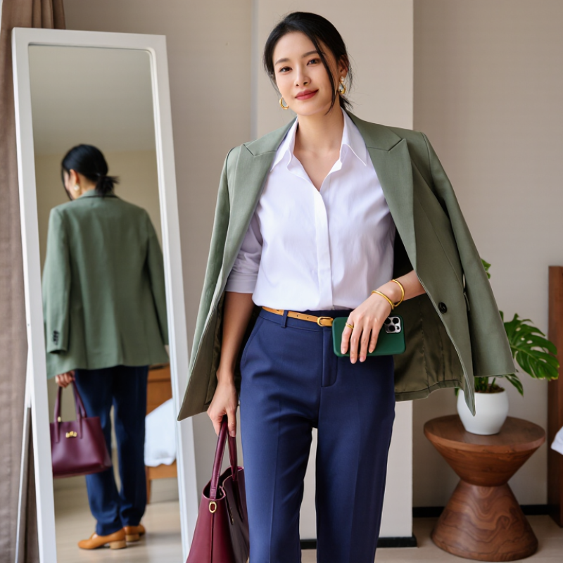
A polished outfit often begins with one dominant hue. The 60–30–10 rule gives that choice a practical structure. Let 60 percent of your outfit carry the main color, such as charcoal trousers, a soft blue shirt, or a cream dress. Use 30 percent for a supporting shade. This could be a tan jacket against navy clothing. Reserve the final 10 percent for an accent, such as a rust scarf, green earrings, or a bright belt. Keep it simple.
In my styling experience, this ratio works best when color appears across visible areas, not only in accessories. A dark base can make a small accent look intentional rather than loud. Color theory also supports this approach because related tones create harmony, while one contrasting shade adds energy. Check the outfit in natural light. Indoor bulbs can change cream into yellow and navy into black. Small details matter. I sometimes choose an accent that looks perfect in the mirror but feels too strong outdoors. That mistake is useful. Adjust the accent, not the entire outfit. The 60–30–10 rule is a guide, not a verdict. Fabric texture, skin undertone, season, and personal comfort can shift the balance. A knitted sweater may visually outweigh a thin shirt, even when both share similar colors. Wear the outfit for a few minutes before leaving, and notice which shade attracts your eyes first. That color may be taking more than its intended share.
A practical outfit-planning guide based on balanced color proportions, hue relationships, and contrast.
| Color Role | Recommended Share | Color Direction | Suitable Garments | Example HEX Palette | Coordination Guidance |
|---|---|---|---|---|---|
| Dominant Hue | Approximately 60% | Deep teal | Coat, suit, dress, trousers, or matching set |
#2F4F4F Dark slate teal |
Use the largest visible color area to establish the outfit’s overall mood and visual direction. |
| Secondary Hue | Approximately 30% | Warm beige | Sweater, shirt, skirt, waistcoat, or layering piece |
#D7CCC8 Soft taupe beige |
Choose a lighter or harmonizing shade to separate the dominant hue without competing with it. |
| Accent Hue | Approximately 10% | Red accent | Scarf, belt, footwear, handbag, jewelry, or small detail |
#C62828 Deep red |
Reserve the strongest saturation or contrast for a small area to create focus and avoid visual overload. |
| Neutral Balance | Optional, within the 60% | Soft white | T-shirt, blouse, socks, lining, or visible base layer |
#F5F5F5 Light neutral |
Use a neutral to soften strong combinations and improve separation between adjacent garments. |
| Analogous Option | 60–30–10 distribution | Green and blue-green | Jacket, knitwear, trousers, and muted accessories |
#388E3C / #00897B Green / teal |
Neighboring hues on the color wheel create a calm, cohesive appearance with lower contrast. |
| Complementary Option | 60–30–10 distribution | Blue and orange | Blue outer layer, neutral base, and orange accessory |
#1565C0 / #EF6C00 Blue / orange |
Opposite hues create high contrast, so keep the brighter complementary color near the 10% accent level. |
| Monochromatic Option | 60–30–10 distribution | Different purple values | Dark coat, medium top, and light accessory |
#4A148C / #8E24AA / #CE93D8 Dark / medium / light purple |
Vary lightness and saturation within one hue family to create depth without introducing another dominant color. |
Color harmony begins with relationships, not identical shades. An analogous scheme uses neighboring colors, such as navy, blue, and muted teal. I often use one dominant color, one supporting shade, and a small neutral accent. This keeps the outfit calm without looking flat. A blue sweater with teal trousers can feel polished, especially with warm beige shoes. Keep contrast gentle. It works well for office settings and daytime events. Still, analogous outfits can become muddy under weak indoor lighting. I once paired two grayish blues and lost the shape completely.
Complementary colors sit opposite each other on the color wheel. Orange with blue, or violet with yellow, creates stronger visual energy. Use one color in a smaller area, such as a scarf, belt, or handbag. A rust-colored accessory can sharpen a deep-blue outfit without overwhelming it. Triadic schemes use three evenly spaced colors, like red, yellow, and blue. They need restraint. Try a dull red jacket, soft mustard trousers, and blue-gray shoes. The muted finishes prevent the combination from appearing costume-like. Test the outfit near a window before leaving. Skin tone, fabric texture, and artificial light can change the result. My color judgments are not always right, so I photograph difficult combinations and reassess them the next morning.
How to Coordinate Colors in an Outfit for a Stylish Look?
Color-temperature analysis makes outfit coordination more precise. Warm colors include rust, camel, mustard, and coral. Cool colors include navy, icy blue, lavender, and blue-based gray. I test each shade near the face, because indoor lighting can distort undertones. A camel jacket may flatter warm skin, while a blue-gray shirt can sharpen cooler undertones. The strongest outfits often use one temperature as the base and the other as a controlled accent. Try navy trousers, a cream knit, and a rust scarf. The contrast feels intentional without looking loud. Keep the accent small.
Professional forecasting supports this flexible approach. The 2024+ World Color Forecast from an international color-professionals association highlights softened neutrals, mineral shades, and nature-based colors across regional markets. These shades are useful because they bridge temperature differences. The 2024 State of Fashion report also identifies uncertainty as a major industry pressure, making adaptable wardrobes more practical. I prefer three-color outfits: one dominant shade, one supporting neutral, and one temperature contrast. The rule is not perfect. Olive can turn yellow under warm bulbs, and mauve may look gray outdoors. I still misjudge them sometimes. Reflection matters. Photograph the outfit in daylight, then check whether the warm and cool tones compete around your face. Extending clothing use can also reduce impact; an Ellen MacArthur Foundation report estimates that using garments for nine additional months can cut carbon, water, and waste footprints by up to 20–30%.
Warm hues such as red, orange, and yellow create energy and visual closeness, while cool hues such as green, blue, and violet create calmness and visual distance. Use one dominant temperature for the main clothing pieces, then add a smaller accent from the opposite temperature to create contrast without making the outfit feel disconnected. The hue-angle values shown here are representative positions on the color wheel.
Color matching often fails under ordinary indoor lighting. A navy jacket may look nearly black, while warm bulbs can make cream fabric appear yellow. Check every garment under standard D65 lighting, which represents average daylight at approximately 6,504 kelvin. The International Commission on Illumination’s CIE 015:2018 colorimetry report identifies D65 as a reference illuminant for consistent color evaluation. This matters when comparing cotton, wool, denim, or synthetic fibers.
Use a D65 light booth or a calibrated daylight lamp. Place garments side by side, not across the room. Examine contrast at arm’s length, then step back two meters. Strong contrast usually appears between dark navy and soft white, while medium contrast works well with olive and beige.
The Illuminating Engineering Society’s lighting guidance notes that color appearance changes with light source spectrum, even when brightness seems similar. Trust your eyes, but verify them.
I also photograph outfits under D65 lighting. It exposes dull undertones and unexpected color shifts. Sometimes my “perfect” pairing looks flat. That is useful feedback. Check shadows, texture, and seam areas carefully. A glossy fabric may reflect light and appear brighter than its actual color. Recheck the outfit after ten minutes, because first impressions can mislead.
Garment contrast is not only a color decision; it is a lighting decision.
Seasonal color planning becomes easier when you read trend reports as guidance, not strict rules. The Pantone Fashion Color Trend Report typically presents ten standout shades and five core classics for each season. I use these colors as a working palette, then test them against skin tone, lighting, and daily movement. A soft blue shirt may look refined indoors but appear pale under strong daylight. Check the mirror near a window.
Build outfits with one dominant color, one supporting shade, and a small accent. For example, try a warm sand jacket, muted green trousers, and a narrow coral detail on a scarf. The contrast feels deliberate without becoming loud. The 60-30-10 styling rule can help, though it is not a scientific requirement. Real wardrobes are less tidy. Sometimes the “wrong” combination works better.
Trend reports also reveal wider color direction. The Spring/Summer 2025 Pantone report highlighted fresh aquatic tones, warm earthy shades, and expressive reds. Use one seasonal color beside a reliable neutral, such as charcoal, cream, or navy. The Global Wellness Institute’s 2024 wellness economy report valued the sector at 6.3 trillion dollars in 2023, reflecting stronger interest in calm, restorative aesthetics. That mood supports softened greens and mineral blues. Still, trend data cannot measure personal confidence. I have followed a perfect palette and disliked the result. Comfort deserves a place in the calculation.
Use one color for about 60 percent of the outfit. Add 30 percent in a supporting shade. Reserve 10 percent for a small accent.
Try charcoal trousers with a soft blue shirt and a rust scarf. The trousers and shirt create a calm base. The scarf adds energy.
Not necessarily. Visible clothing areas usually create stronger balance. A dark base can make bright earrings or a belt feel intentional.
Indoor bulbs can turn cream yellow and navy nearly black. Stand near a window before leaving. Test it outside.
Yes. A thick knitted sweater may visually outweigh a thin shirt. Texture can make one shade appear larger than expected.
It combines neighboring colors, such as navy, blue, and muted teal. The result often feels calm and suitable for daytime settings.
Pair a strong color with a smaller opposite shade. For example, add a rust scarf to deep-blue clothing. Keep the accent limited.
Use three spaced colors with softened finishes. A dull red jacket, mustard trousers, and blue-gray shoes can feel balanced.
Improve the contrast or replace one shade. I once combined two grayish blues and lost the outfit’s shape. The mistake was useful.
Wear it for several minutes, then photograph it near a window. Recheck the image later. My first judgment is not always correct.
Learning how to coordinate colors in an outfit begins with choosing a dominant hue and applying the 60–30–10 rule: use one main color for most of the look, a secondary shade for support, and a small accent for visual interest. From there, color harmony can be developed through analogous combinations for a smooth effect, complementary pairings for contrast, or triadic schemes for balanced vibrancy. Considering color temperature is also important, as warm and cool tones can either complement or overpower one another depending on their intensity and placement.
For a polished result, examine the outfit under standard D65 lighting, which provides a consistent daylight reference and helps reveal unexpected clashes or weak contrast. Seasonal choices can then be refined by observing current color directions in professional fashion trend reports, while still adapting them to personal preferences and skin tone. This structured approach makes color coordination more intentional, versatile, and stylish.
Faber Fashion